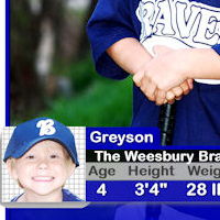
In the this tutorial we are going to learn how to make a simple Baseball or Sports Card Template in Corel Paint Shop Pro. Photoshop and Gimp users should be able to easily follow along as well.
This is a very easy tutorial to complete. More experienced users will be able to follow along by just looking at the placement of the layers. I made several of these for some of the kids on our local Pee Wee baseball team. Our team is the Weeksbury Braves located in Weeksbury, Kentucky. The kids love them and it was a fun project for me as well. I hope you find it enjoyable and beneficial too.
Video Demonstration
Reserved for Youtube Video Demonstration. You are welcome to use it as reference once posted.
Step 1
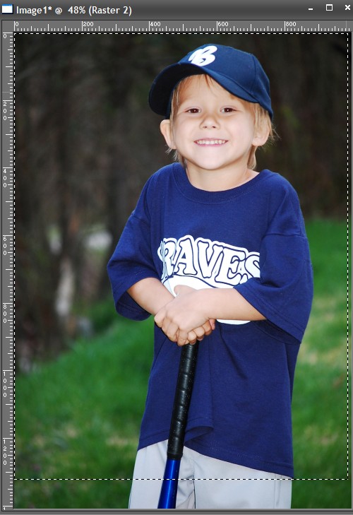
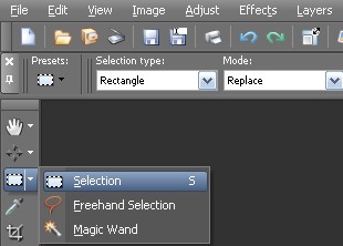
Open up the baseball photo(s) you want to use. Create a new Raster Layer and name it “Border.” Then draw a selection around the edge of the photo using the Rectangle Selection Tool.Next, Flood Fill it with white.
.jpg)
Step 2
With the selection still active go to Selections > Modify > Contract. Set the number of pixels to around 30 (or set it to a number that works best for the size of your photo. Next, Flood Fill the new contracted selection with Blue (or color of your choice). Now, contract the selection again to about 12 pixels and Flood Fill it with Black. Finally, contract the selection to around 3 and then Press Delete. Press CTRL + D to deselect the selection.
.jpg)
.jpg)
.jpg)
.jpg)
.jpg)
.jpg)
.jpg)
Step 3
Create a New Raster Layer and name it “Left Corner.” Select the Freehand Selection tool(point to point) and draw a triangular selection in the top left hand corner. Flood Fill the selection with Black. Then contract the selection to 3 and Flood Fill with Blue or color of your choice. Press CTRL + D to deselect. Finally, drag this layer under the “Border” layer.
.jpg)
.jpg)
Step 4
Create a new raster layer and name it “Bottom Feather.” Select the Rectangle Selection tool and draw a selection towards the bottom of the photo. Once you have the selection drawn, go to Selections > Modify > Feather and set the number of pixels to 16. Finally, Flood Fill the feathered selection with a dark gray color. Press CTRL + D to deselect.
.jpg)
.jpg)
.jpg)
Step 5
Create a New Raster Layer and name it “Rounded Square.” Select the Rounded Rectangle Selection tool, and draw a selection similar to size and location of the below photo. Flood Fill the selection with gray. Press CTRL + D to deselect.
.jpg)
Step 6
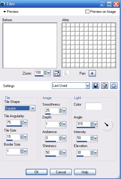
Create a New Raster Layer and name it “White Square.” Select the Rectangle Selection tool, and draw a selection similar to the size and location of the below photo. Flood Fill the selection with white. With the selection still active go to Effects > Texture Effects > Tiles and use the settings similar to the photo below to create the tiles/bars. Press CTRL + D to deselect. NOTE: You don’t see the tiles in mine just yet, because it was an effect that I added after I had already finished screen captures for this tutorial.
.jpg)
Step 7
Now we are just going to keep repeating this process until we have all of our shapes for our bottom graphic created and in place. Use the photos below as a reference. Just remember to make a new layer for each new graphic/shape, and then rename each new layer. This will allow us to easily identify a particular graphic for future layer adjustments. You can use the naming conventions I used below to make it easier to follow along. You will either use the Rounded Rectangle Selection or Rectangle Selection tool to make the selections for your graphics. Once your selections are complete, drag the “Rounded Square” layer under the “Bottom Feather” layer.
.jpg)
.jpg)
.jpg)
.jpg)
.jpg)
Step 8
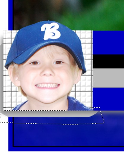
Open up another baseball photo of your son or daughter, or you can use another copy of the same photo and cut out the head from the shoulders up using the Free Hand Selection(point to point) tool. Once your selection around the head and shoulders is complete, go to Edit > Copy. Next, create a new raster layer above the “white square” Layer and name it “Face.” Then go to Edit > Paste as New Selection. Use the deform tool to resize/adjust the head by pressing ‘D’ on your keyboard. Next, lower the opacity of the face layer, and use the Free Hand Selection tool to select the areas around the bottom to trim off. Press the Delete key to trim the selection. Turn the opacity back to 100 percent.
.jpg)
.jpg)
.jpg)
.jpg)
Step 9
Select the “Bottom Feather” Layer. Next, use the Rectangle or Freehand selection tool to trim up the “Bottom Feather” Layer like in the photo below. Just make a selection around the area you want to remove and press DELETE. At this time trim and adjust any other layers that need adjusting/trimming as well.
.jpg)
.jpg)
Step 10
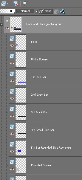
Group all the bottom parts of the logo into one group. To create the group simply right click on the “Face” layer, and select New Layer Group and rename it. I named my group “Face and Stats.” Drag all the layers that make up the bottom logo into this group.
.jpg)
Step 11
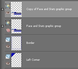
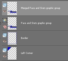
Select the “Face and Stats” group layer, then right click and select Duplicate (We are creating a duplicate so that you can go back anytime in the future and make adjustments). Select the “Copy of Face and Stats” Group layer, and then right click and select Merge > Merge Group.
.jpg)
Step 12
Select the “Merged Face and Stats” layer and lower the Opacity toaround 40 percent. Using the selection tool, trim the areas covering the border like in the photo below. Turn the Opacity back to 100 percent.
.jpg)
.jpg)
Step 13
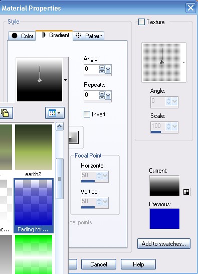
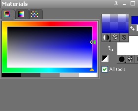
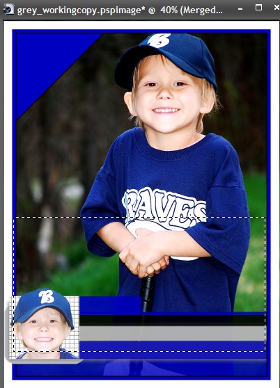
Create a New Raster Layer under the “Border” layer named “Gradient.” Next, use the Rectangle Selection tool to draw a selection like you see in the photo below on the “Gradient” Layer. Now, set the Foreground Color to Blue. Next, double click on either the foreground or background colors in the Material Palette to pull up the Material Properties window. Inside the Material Properties Window select the Gradient tab and choose the “Fading Foreground” gradient and then select OK. The Foreground in your Materials Palette should look like the image below. Select the Flood Fill and fill the selection with the Fading Gradient.
.jpg)
.jpg)
Step 14
With the “Gradient” layer selected, select the Rectangle Selection tool and trim it up like you see in the photo below. Just make a selection and press “Delete” to remove then press CTRL + D deselect.
.jpg)
Step 15
Download this free stock baseball logo graphic and open it up in Paint Shop Pro. You can just grab the preview version because it will be large enough. Select the magic wand located in your selection tools.
Using the magic wand click the outer white area (the wand will automatically select all the white background) and press Delete to remove the white background. Press CTRL + D to deselect. Finally, go to Edit > Copy.
.jpg)

.jpg)
Step 16
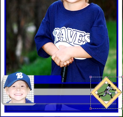
Create a New Raster Layer named “Baseball Diamond logo” above the “Merged Face and Stats” layer. Select the “Baseball Diamond logo” layer and the go to Edit > Paste as New Selection. Press ‘D’ on your keyboard to pull up the deform tool to resize and position the logo.
Step 17
Create a New Raster Layer and name it “Team Number.” Set the foreground and background both to white, and then select the Text Tool. Choose the Font and Font Size of your choice and type your son/daughter/players number. Use the Move tool(by pressing ‘M’ on your keyboard to position the numbered text into place. Next, go to Effects > 3D Effects > Drop Shadow to apply the drop shadow. See settings in image below.
.jpg)
Step 18
Keep repeating step 17 for the rest of the text you want to apply. Just create a new layer each time, and give it an easily identifiable name. To align the text evenly, turn on the grids by going to View > Grid. Repeat to turn off the Grids. Once you have added all the text you want to add, go ahead and group them together like we previously did in step 10.
.jpg)
.jpg)
.jpg)
.jpg)
.jpg)
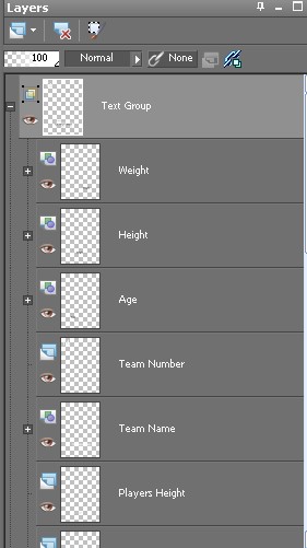
Step 19
Finally, using your Rectangle Selection tool, make a selection around the outside of the border. Next, go to Edit > Copy Special > Copy Merged. Then go to Edit > Paste as New Image. Go to File > Export to export the image to your favorite format. Don’t forget to save your original baseball template as a pspimage or psd file.
.jpg)
.jpg)
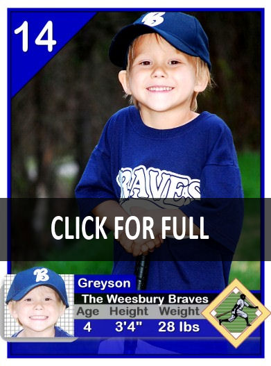
Final Results
That’s it. Hope you enjoyed working through this tutorial.

12 Responses
Beautiful result!
I suppose that Greyson at age 4 may not be very bothered yet by the apparent spelling mistake of his team’s name on his card: The Weesbury Braves.
Should it not be The Weeksbury Braves?
Andre, yes, you are correct. LOL.. I have looked at that photo a 100 times and never seen that. Good thing these were not the ones I had printed. I put together this tutorial a couple weeks after I had created the original template file.
Very helpful tutorial. Keep up the good work.
[IMG]http://i42.tinypic.com/2py5l34.jpg[/IMG]
I made mine. Thank you for teaching me new things.
http://i42.tinypic.com/2py5l34.jpg
I used a boxing image.
🙂
this is so cool I would like to try this for my sons football photo.
HELP!!!!! I have tried to use the magic wand the way you showed and every other way possible and I can not get it to work. When I have the mode in remove it will not even highlight the white area of the baseball logo. When i have it on replace it will highlight all the white around the outside but then when I push delete it deletes the logo instead of the white. I have tried every setting I can think of but it still is not working. HELP
Hi,
Stepwise presentation is good and easy to understand.
Nice tutorial but missing a lot of steps. A bit much for a beginner like me who haven’t yet figured my way around PSPPX2.
I am apreciating it very much.I have never read such a lovely article and I am coming back tomorrow to continue reading.
oh! it’s very good !thank you!
Your Comments WILL IT PRINT OUT ” 9 ” , 3.5 INCH X 2.5 INCH CARDS OF GREYSON ON 1 PAGE ?